MaterialPaginationisacustomizableandflexiblepaginationwidgetforFlutterapplications
MaterialPagination is a customizable and flexible pagination widget for Flutter applications. It allows you to easily create pagination controls with numbered page buttons, next/previous arrows, and extensive customization options.

Material Pagination


MaterialPagination is a customizable and flexible pagination widget for Flutter applications. It allows you to easily create pagination controls with numbered page buttons, next/previous arrows, and extensive customization options.
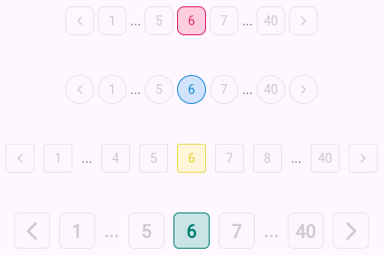
Screenshots


Features
- Customizable page buttons, including their size, style, and color.
- Previous and Next navigation arrows.
- Supports any number of pages with a configurable visible page range.
- Darken effect for the active page.
- Callback for page changes.
- Flexibility to adapt to various designs and themes.
Installation
Add the following to your pubspec.yaml:
dependencies:
  material_pagination: ^1.0.0
Then, run:
flutter pub get
Usage
Basic Example
import 'package:flutter/material.dart';
import 'package:material_pagination/material_pagination.dart';

class PaginationExample extends StatelessWidget {
  @override
  Widget build(BuildContext context) {
    return Scaffold(
      appBar: AppBar(title: Text('Pagination Example')),
      body: Center(
        child: MaterialPagination(
          currentPage: 1,
          totalPages: 10,
          onPageChanged: (page) {
            print('Page $page selected');
          },
          visiblePageCount: 5,
          activeColor: Colors.blue,
          inactiveColor: Colors.grey,
          fontStyle: TextStyle(fontSize: 16, fontWeight: FontWeight.bold),
        ),
      ),
    );
  }
}
Parameters
| Parameter | Type | Description | Default |
| ----------------------------| ------------------------ | ------------------------------------------------------------------------------------------------------- | --------------- |
| currentPage | int | The current active page number. | 1 |
| totalPages | int | The total number of pages available. | Required |
| onPageChanged | Function(int page) | Callback when a page number or next/previous arrow is pressed. | Required |
| visiblePageCount | int | Number of page buttons visible at one time. | 5 |
| activeColor | Color | The color of the active (selected) page button. | Colors.blue |
| inactiveColor | Color | The color of the inactive (non-selected) page buttons. | Colors.grey |
| fontStyle | TextStyle? | The text style for the page numbers. | Default |
| buttonSize | double | The size of each page number button. | 32.0 |
| iconSize | double | The size of the arrow icons. | 12.0 |
| iconGap | double | The gap between page buttons and next/previous icons. | 4.0 |
| borderRadius | double | The border radius for the page number buttons and icons. | 8.0 |
| colorDarkness | double | Value between 0 and 1 to adjust the darkness of the active page's button border. | 0.3 |
Advanced Example
MaterialPagination(
  currentPage: 3,
  totalPages: 15,
  onPageChanged: (page) {
    setState(() {
      _currentPage = page;
    });
  },
  visiblePageCount: 7,
  activeColor: Colors.green,
  inactiveColor: Colors.grey,
  fontStyle: TextStyle(fontSize: 14, fontWeight: FontWeight.w500),
  buttonSize: 40.0,
  borderRadius: 10.0,
)
Customization
Custom Button Style
You can fully customize the appearance of the page buttons by modifying the fontStyle, activeColor, inactiveColor, and other related properties.
MaterialPagination(
  currentPage: 1,
  totalPages: 20,
  onPageChanged: (page) {
    print('Page $page selected');
  },
  fontStyle: TextStyle(fontSize: 14, fontWeight: FontWeight.w600, color: Colors.white),
  activeColor: Colors.orange,
  inactiveColor: Colors.black,
  buttonSize: 30.0,
)
Next/Previous Buttons
This widget also supports next and previous arrow buttons to easily navigate between pages.
MaterialPagination(
  currentPage: 5,
  totalPages: 50,
  onPageChanged: (page) {
    print('Page $page selected');
  },
  iconSize: 16.0,
  iconGap: 8.0,
)
Running Tests
You can run tests by using the Flutter testing framework:
flutter test
Contributing
Contributions are welcome! Feel free to open an issue or submit a pull request.
License
This project is licensed under the MIT License. See the LICENSE file for details.